Showing posts with label Fantasy. Show all posts

Thursday, July 3, 2014

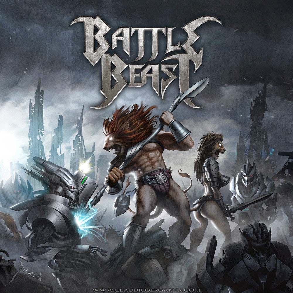
Battle Beast


This certainly was one of my favorite projects.  Not only due to the fantasticaly fun concept but also because of the band behind it.  And in the process of making the next chapter in the story, I thought it was only appropriate to explain a little bit how it all started.

The first time I listened to Battle Beast's music I was blown away by their classic metal flavor and how super catchy their songs are. Right up my alley!!!  

I am a child of the 80s...  a true generation X geek.  I grew up watching Masters of the Universe, Thundercats and Transformers so to say the project fed my inspiration and excitement is really an understatement! 

The original working title of the album was 'Machine Revolution' but somewhere along the line the guys decided to simply call it 'Battle Beast'.  I guess it was a statement of rebirth since they were presenting a new singer and a fresh new sound production; this time recording an mixing resided in thr sole hands of young Anton Kabanen.  And I must say he did a killer job.

Anton gave me specific sources of reference and inspiration but at the same time gave me enough room for creativity to propose an original scene.

Some of the reference material for inspiration he gave me was 'The Terminator, 'Mad Max and of course 'He-Man and the Masters of the Universe'.  Funny that while recently checking our notes I realized Thundercats and Transformers were never among the original references, but everybody assumed they were the main source of inspiration.  I should take the blame; I guess some things found their way out of my subconscious!

Either way, though obviously cats, the main characters are closer to Conan The Barbarian and Frazetta's work than to Thundercats; which wear color spandex body suits and not bronze age garments in partial nudity!.  The concept is just pure old school epic fantasy art with a modern flavor.  The perfect mix for me.

I proposed two basic sketches for this project. Both set in a fierce battle between Cats and Machines.  Surprisingly enough, the first sketch hit right on the mark!   The second sketch was obviously on the right track but lacked the iconic composition and spectacularity we needed.  No lioness either!   In the original sketch, the lioness wears a battle style maw-hawk but Anton pointed out that it was maybe too unfeminine, so I gave her a very sexy feminine hairstyle.

Anton asked me to make the main characters the center of attention so I just applied one of the oldest tricks of classic painting;  to suggest background through shapes and silhouettes.

The technique I used for this job consists basically in a very detailed grey pencil drawing later colored digitally.  Only the 'irregularity' and raw finish of the pencil can give the feel of analog art...  people know when it's a full digital work!

The scene required a very dramatic lighting atmosphere.  The sense of a battle that has been going on for hours and it's close to the end...  maybe all night!  In fact someone pointed out how the sunlight from the left manages to pass through the all the chaos and smoke get to the cats in a very hopeful way... a sort of hint of hope for our brave warriors, though surrounded by evil enemy forces, might still have a few surprises!!!   Honestly I never intended it as sunlight but what do I know!? Maybe it is!

Personally, I saw this project as my grain of sand to the dynasty line of epic album covers.  I remember being immensely captivated as a teenager with Ken Kelly's larger than life album covers for KISS and Manowar.   His work eventually led me to discover the fantastic work of Frank Frazetta and Boris Vallejo;  my life was turned upside down after that... I knew what I wanted to do in life.


The cool thing about working with Battle Beast is the fact that I know that for each new cover, there will be a new story to tell about our Lion-Man.   It's not that common to work in a consistent ongoing fantasy project with permanent characters... specially in metal music!  So for that I'm very grateful.

Who knows what new adventures are still ahead for Lion-Man!  Unleash the Beast!!! 


Click on every image for larger view:


The first sketch hit right on the mark!


The second sketch was obviously on the right track but lacked the iconic composition and spectacularity we needed.  No lioness either!


Refined pencil sketch of the concept.  This was the blueprint of the cover.


 Basic pencil render of the main character.  Later digitally colored.


Basic pencil render of the battle lioness.  Later digitally colored.


Basic pencil render of one of the cybernetic enemies.  Later digitally colored.


Final illustration.


Friday, August 17, 2012

Rata Blanca

Here I go...  my first medieval castle!

Rata Blanca is the most classic heavy metal band in South America and this image was commissioned to celebrate the 25th Anniversary of the band.  When it comes to album covers, working with classic bands is always a privilege for any visual artist.   One of the first things that got me into art and graphics when I was a kid were all those fantastic illustrations on heavy metal covers from the 70s and 80s.  So the minute this band got in touch with me, I knew it was going to be something special.
The original gold was to upgrade the cover of the band's first album; a modern, more sophisticated version of that old castle.  Even though the original illustration is extremely simple, I didn't want to departure too much from it; just to add more detail, color and volume.  

My first approach was to add characters since I thought it lacked some action; so the first sketch featured a wizard and a couple of dragons!  This idea was quickly dismissed by Walter Giardino (the band's leader).  He also didn't want to departure too much from the original idea.  So I made another one, which was according to Walter, right on track but "too evil".  "It has to look magical and welcoming... people should really want to come inside", were his words.

So my final proposal is what you see here.  For this, I researched a lot of photo material of castles all around Germany and Austria.   

So please!  Come inside!

Follow me on Facebook: www.facebook.com/claudiobergamin.art
Follow me on Twitter: twitter.com/Bergamin_Art


click on every image for full size


Cover


Cover with logo


Sketch #1 (unused)


Sketch #2


Sketch #3 (with variations suggested by Walter)


Original Cover (1987)


---


Friday, August 10, 2012

A Journey to The Hollow Earth

I'm a huge geek of strange myths and the paranormal but I don't have the habit of proposing that kind of stuff to my clients. Strangely enough, these subjects find their way to me regardless.   This concept was commissioned by AFM records to be cover art of the album "Center of The Great Unknown" by romanian band Magica.


The Hollow Earth is probably one the most popular paranormal myths. According to Hollow Earth theorists, all planets are hollow and you can access the interior through huge 500 miles openings in each pole. Supposedly, as you navigate or fly through these openings, you are never really aware of where you're going since the holes are so huge that curvature is not perceived by the view.
As our "exterior surface", the "inner surface" has also oceans and continents with various landscapes. All life in the interior is possible due to the "inner smoky sun". It is said that the inner civilization is much more advanced than ours, they had electricity hundreds, probably thousands of years before we had, some people even have suggested that the inner earth inhabitants are the survivors of the last global extinction event some 100.000 years ago; survivors of the big flood and even the lost continent of Atlantis. It has been suggested that even UFOs might have their origin in the Earth's interior!

There have been several expeditions with the intent of proove or disproove this great myth. There are stories of miserable failures and fantastic accounts of new civilizations. One of the most popular stories is Admiral Byrd's expedition to the North Pole. In his Diary, he describes an encounter with the leader of the inner civilization; after that meeting, the leader sent Byrd on his way with a terrifying warning about humanity's fate.


The artwork is partly based on Admiral Byrd's Diary of his expedition to the North Pole and partly based on the book "The Goddess of Atvatabar" (which is somewhat similar to "Journey to the Center of The Earth by Jules Verne). The book tells the story of a group of expeditionaries in route to the North Pole on board a trap steamer. Eventually, they realize that they are actually going to the interior of the Earth through a huge opening in the Earth's pole!. Once inside, they sail the inner oceans to discover amazing cities and new civilizations.

Since I haven't yet visited, the interior of the Earth, I have no idea of how exactly the landscape looks like...   so imagination was a big factor here.    It was quite an issue to achieve the inner-horizont effect; since we are in the opposite/interior side of the Earth's crust, the horizont should curve upwards instead of downwards. The result is a spectacular view of the landscape curving up to the clouds and all the landmasses visible "in the sky". Since the "inner sun" is floating static in the Earth's center, all shadows must be at a perfect 90 degree angle underneath everything. If I would have follow this idea to perfection, the result would've been a very flat (and boring) lighting setting... so I decided to cheat; you can't actually see the sun, but light comes slightly from behind... resulting in a much more dramatic effect.

So here you have it... my take on the inner earth

Click on every image for full size.


Album Cover Art


Wide alternate scene


Concept Sketch #1


Concept Sketch #2


...


Tuesday, July 10, 2012

Blind Souls

This might strike you as difficult to believe, but I'm really not good at creating nightmares and dark scenes!  I'm a pretty mellow guy; my favorite movie is Star Wars and I enjoy long marathons of Friends.  So you can say I stay in the realm of the positive side of life...  in fact, in recent years I even stop watching the news, the world is a horrible cruel place.  I've become a reclusive of the fantasy world...   almost everything I watch and read is either science fiction or fantasy.   It's all escapism.

So basically for this image I had a difficult time creating a visual situation I could feel strong and meaningful...  I really don't like horror for the sake of horror.  It's like pornography.  For me, art has to contain some kind of metaphor or clever message; even if this seems kind of obvious, it is not.   The internet is saturated with cool looking images that mean absolutely nothing.  

The basic concept for this one was the contrast and juxtaposition of Heaven, Purgatory and Hell.  I tell you, it was by no means easy getting to this solution!   The band originally suggested to depict Purgatory as a dark horrible place, much like Hell...  but then, you would have a cover with "two Hells"!  So I said NO, we will do Purgatory as described in religious mythology:  as a stationary place to contemplate our mistakes... neither rewarded or punished.  Since most people isn't totally good or totally bad, I imagined Purgatory as the most crowded place in all the spiritual realm... I mean really crowded!   Hell would be like nothing we couldn't find on earth; just a horrible place abundant in physical pain and torture.  Finally, Heaven would be a place of meditation; bright and peaceful.

I think the final result is quite surreal...


Cover (wide format)


Cover (Cd format)


Concept Sketch


Unused Concept Sketch #1


Unused Concept Sketch #2


---

Wednesday, June 20, 2012

Pink Beatles In A Purple Zeppelin

So here you have it!  Finally!  The flying beatles!!!

This is probably the most extravagant idea I've ever translated into graphic reality...  and it's all Arjen's "fault"!   

As all of you probably already know, this image is the cover of a song from the "Lost in The New Real" album.  The song is about a music service in the far future; they'd be able to create perfect virtual bands for you!  Let's say you love all the crunchy riffs of Black Sabbath and all the majestic operatic vocal arrangements of Queen...  No problem!  They'll blend these two elements together for you and create a new band:  Queen Sabbath!

At first, I thought the concept was just too abstract to actually come up with some solid type of scene...  what could I do?  A computer with musical controls and some technitians working around it?  A collage containing all the bands in history?   I couldn't exactly visualize it graphically until Arjen said:  "...no man, let's do it exactly as the title!" "...what?" "yeah, let's do some pink beatles flying in the sky on purple zeppelins" "wow, that is so crazy that it might actually work!".  I just loved the idea; it's so different from what I normally do.

I immediatelly knew we would need some special techinque for this; my usual fantasy painting technique wouldn't be the most perfect solution for this theme.  The song was also very old school and slightly hippie.  So I thought nothing would accomplished better this than a trippy 60s image in the style of Hipgnosis!   

I used my own photo material as a starting point to create the composition; except the zeppelins, which I took from historical photographs.  The colors are the result of endless experiments but the gold was obviously an LSD extravaganza!   I went back in time to possess the mind of a graphic artist living in 1969!!!   

So... enjoy the trip!  


The Song


The Art

The Cover Art


Arjen's Discography!


Wallpaper!


---

Friday, April 27, 2012

Yellowstone Memorial Day

Like I said before, "Lost In The New Real" is probably the most richly illustrated album I've ever participated in.  The booklet alone seems like a mini graphic novel!

This particular image illustrates the song "Yellowstone Memorial Day", which is about a massive volcanic eruption in Yellowstone Park.  The moment Arjen told me about the subject of the song I knew how technically difficult it was going to be;  I've never painted neither a volcano or lava before, so as usual, in preparation for this task I reviewed tons of photographic material.  This is what is illustrators call research; I saw countless pictures of volcanic eruptions like the ones of Etna, St Helens and Krakatoa.  I really wanted to get it right but obviously with the fantasy touch on scale and atmosphere.

Te result speak for itself... I think it took me around four days, 8 hours a day.  It is an extremely detailed painting.   Hopefully, Arjen will print posters someday to take advantage of its full resolution.

Enjoy the armageddon!!!


---

Thursday, April 19, 2012

Sic Semper Tyrannis

Colonization and cultural contamination are two subjects (or maybe just one) that I always been interested in. Nothing good could result when a developed society invades (either in a friendly or unfriendly manner) a more primitive culture. 

There is plenty of examples for this in history but this image deals specifically with the colonization of South America. It was commissioned by chilean band Huinca (term for the non-aborigine in Mapuche language) as cover art. The concept is a mix of a little bit of mythology with modern politics... it blends the ancient battle of the common man against an impossible adversary (like David and Goliath), which in this case is represented by a massive Lovecraftian creature; in its back, it carries what I call the "unholy trinity" of powers... war (missiles), religion (a cathedral) and economics (oil plants + Wall Street).

Our heroes, are representatives of the three main aboriginal cultures of the lower part of South America: Mapuche, Inca and Rapa-Nui (Eastern Island).  All three against an all-powerful and evil adversary... will they succeed???


This was the second of two sketch proposals; the original concept was a rendition of David and Goliath; a regular joe against a super-powerful foe.  The Cuthulhu-like creature came out almost naturally.    The three aboriginees, represent the three main cultures of the chilean territory (even though Rapa-Nui or Eastern Island is in the middle of the Pacific!!!).  I wanted it to be really epic!   to achieve this I new I needed a very dramatic lighting treatment and a spectacular angle view to take full advantage of size and scope!  It was painted in adobe photoshop; I used very thin brushes for the all the details of the main characters and really thick hairy brushes for the landscape, which is rough and texturized...  this is a classic Frazetta trick!   


I had a lot of fun making this one...  enjoy!


click on each image to enlarge:


Original wide view composition.


Album Cover


Concept Sketch


Unused Concept Sketch


Saturday, April 7, 2012

Dr. Slumber's Eternity Home

This image was produced for Arjen Lucassen's "Lost In The New Real" album.


Not every day I get the chance to explore humor in my art commissions.   Most of my clients have an interest for the darker side of life, which I always try to approach with some irony; I couldn't possibly go dark all the way (well, not all the time!)...  I need at least a little bit of dark humor.  Well, this image goes way beyond your usual sarcasm...  it embraces it.


One good day, Arjen sent me this really happy song about a euthanasia clinic in the future...  only Arjen could get away with something like this!    "I want a twisted Doctor and two hot dancing nurses in front of their clinic", he said.    I thought this concept was insane!  But immediately regarded its endless graphic possibilities.  I envisioned the classic "mad scientist" in his creepy Art Deco laboratory;  tesla coils everywhere and a stormy sky!


In Arjen's words: 
"This is a very happy song about...suicide! I wanted the image to look like a campy advert for a 'euthanasia home', where (in the far future) people could voluntarily end their lives in a humane way. But of course I wanted it to be very tongue-in-cheek so we could get away with it, it's such a delicate topic! There had to be an evil doctor holding a syringe, some dancing nurses, a building with sleazy neon letters and a menacing sky. But I expected that would be impossible... Imagine my surprise when Claudio arranged a REAL doctor holding a real syringe and two hot nurses! This image is amazing, just look at all the intricate details that Claudio came up with. A both funny and disturbing image, not easy to make! Claudio did an amazing job with this one, I think this is my favorite image in the booklet"


Concept Sketch #1 


Concept Sketch #2


Behind The scenes with "The Nurses"


Friday, August 5, 2011

The Unholy Trinity

I've recently produced several images about the Illuminati mythos. In this one, we actually get to see one of them.

The unholy trinity of powers of the world: Economy and his two bitches, war and religion. I am very aware this image might upset some people but is just the way it is, the way it has always been.

You are probably wandering just who are the people depicted in the portraits on the far wall.  Well, they're very relevant personalities related to this concept, you may like to check on each of them:  Issac Newton, Leonardo DaVinci, Jacques de Molay,  Alister Crowley and Sir William Sinclair.

Suggested reading and media to complement this picture's subject:  Any book by David Icke, Zeitgeist (documentary), Inside Job (documentary), The Shock Doctrine (documentary) and of course ultimate Illuminati documentary: watch here.

I can't even tell you how much work I put into every little detail of this one... it was a graphic nightmare.  
If you live in Europe you might spot the vinyl edition in your local metal music store: It was produced for a very cool progressive metal band from germany; The Outside.
http://www.the-outside.net/

cheers!


Click on each image to enlarge
Cover (poster version)

Cover Art (vinyl version)

The Bank Corporations

The Military

The Catholic Church

Concept Sketch
 
Concept Sketch (alternate)

Friday, June 10, 2011

Enciende Tu Mente (Turn On Your Mind)

The concept for this one is kind of elusive. As the band originally explained, it was about expressing yourself against a hostile society. Projecting your inner self energetically. "Enciende tu Mente" is spanish for "Turn On Your Mind" so that may deliver some clues.   The TV sets are just a way to represent a hostile social environment; envy, prejudice and worse.

For me, this is X-Men meets Carrie.

Click on each image to enarge

Cover Art


 Cover Art with logo and title


 Concept Sketch


Tuesday, May 3, 2011

"True Gods", Animated Video

This is one of those opportunities in which you end up doing something you never knew it would get bigger and bigger and bigger...  I landed in the chair of Director before even considering directing anything!

One day my good friend Ubaldo asked me "can you make me an animated video for my song True Gods???   I foolishly replied "of course!", without even imagining what I was getting into.   Very early in the process I realized I wasn't going to get the job done all by myself so I recruited a very talented young illustrator called Jonathan Larenas to help me with all the characters.  Of course since I don't have a clue about animation software I relied on the talents of Altair Films, a very prolific special effects company.  With this assemble, "True Gods" eventually became a reality.

The Plot:
In ancient times, the Anunnaki arrived on Earth to enslave humans and put them at work mining precious minerals. This however didn't past unnoticed by the cosmic forces...  in a remote planet called Parramon, someone is watching...

The Song:
True Gods is a song from the album "Dead People", by british band Parramon. 

The Crew:
Directed By Claudio Bergamin
Produced by Altair Films
Script by Ubaldo Esteban and Claudio Bergamin
Illustrations by Jonathan Larenas, Claudio Bergamin and Luis Saavedra
Animation by Jose M. Del Solar and Cristian Cristallini


THE VIDEO


CONCEPT SKETCHES
(blue sketches by Jonathan Larenas)


 STILLS


 PROMO IMAGES